Hoboken, NJ: Visual Identity, Wayfinding System, and Streetscape Improvements
In 2014, the City of Hoboken engaged me to advise the design process for the city’s new visual identity, wayfinding system, and streetscape improvements funded by an $880,000 federal Community Development Block Grant for Superstorm Sandy Disaster Recovery. I helped the city and its graphic design firm identify elements that define the city, refine design concepts, and create the identity and graphics standards to help Hoboken stand out among cities in the New York & New Jersey urban region.
The visual identity system builds on two of the most recognizable informal identifiers for Hoboken: The rail-spike “H” seen in the PATH subway station, and on rail trestles at the city’s southern entrances; and the moniker “Mile Square City”. Each has wonderfully unique characteristics. The angled spikes of the “H” are a throwback to the days when the region’s economy was first being built on the backbone of rail transit, and a nod to the city’s current resurgence built on its strong transit connections to New York. “Mile Square City” is an apt descriptor of the city’s size, and a reference to its compact, walkable urban character.
In the new visual identity system, these two well-known icons became the city’s official logo and tagline. Hoboken’s new identity is used throughout the city in a wayfinding system with a set of consistent, thoughtfully-designed branding elements and tools, including maps, kiosks, directional blades for intersections, a color palette, and a font family.
The $880,000 federal Community Development Block Grant funded streetscape improvements along First Street, from the western edge of the city to the central business district, that incorporate the the new identity and wayfinding system. Clear markings for travel, turning, and bike lanes help drivers see the street as a shared space. Designated bike lanes provide a safe space for cyclists, and reduce the conflict with pedestrians that happens when unsafe streets force cyclists to use sidewalks. Curb extensions provide extra space for large volumes of pedestrians to wait safely at intersections, reduce the distance for pedestrians to cross streets, and make vehicle turns safer and slower by enforcing a wider turning radius. By appropriately balancing the needs of bicyclists, drivers, and pedestrians, a complete street sets better expectations for everyone.
Construction documents, used by contractors to guide work during construction, show the streetscape improvement elements planned for each intersection to ensure it meets the needs of a complete group of street users, including pedestrians, cyclists, businesses, and drivers.
Draft map showing locations and sign types for the wayfinding system used throughout the city.
Brand identity is an important placemaking tool for cities to convey their unique and important attributes, and present a consistent, recognizable presence to businesses, residents, and visitors. The development of Hoboken’s identity system around the “H” is similar in concept to visual identities based on iconic symbols associated with other cities, states, and places. Here are four placemaking identities I used in my work with Hoboken.
Amsterdam, Netherlands
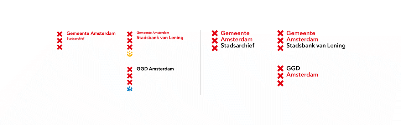
Dutch design firms edenspiekermann and Thonik developed an identity system for Amsterdam based on the iconic Saint Andrew’s Crosses. When the new identity system was revealed, several Dutch media outlets criticized the work as nothing more than a line break for €100,000. Edo van Dijk, co-founder and creative director of edenspiekermann, explained in It’s not the logo how the firm took the 40+ disparate visual systems and assets it encountered at the outset, and developed an identity system based on the iconic logo that could unify dozens of variations created by neighborhoods and municipal entities within the city. The new brand (right) requires less horizontal and vertical space than the previous design (left), removes font size inconsistencies, and provides a consistent space below the “Gemeente Amsterdam” wordmark to accommodate an agency, district, or service name.
Porto, Portugal
The identity for Porto, Portugal’s second largest city, draws on the blue and white tile prevalent throughout the city, and uses an interchangeable set of line drawings that can be paired with the wordmark to represent various city agencies and services. The drawings themselves are also used to create striking background patterns for signage and advertising.

Eindhoven, Netherlands
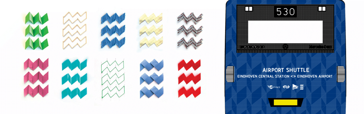
The identity for Eindhoven, a city in the southern Netherlands, consists of three red zigzag bands that appear crisp, strong, and complementary alongside other brands for businesses, regional and national governments, sports teams, and public transit agencies.
Colorado, US
A new brand identity for the State of Colorado plays on one of the state’s most recognized natural features: the snow-capped peaks of the Rocky Mountains. In reviewing the new identity, Brand New editor Armin Vit notes a common criticism of destination and place brands–that they don’t necessarily represent every nuance and detail of the place.
The new logo makes an immediate impact: it’s simple, easy to remember, bold, and it says Colorado right away. Does it encompass all the nuances of the state? No. No single destination logo does that. A lot of the complaints are that the logo looks like a road sign — well, that’s perfect, isn’t it?