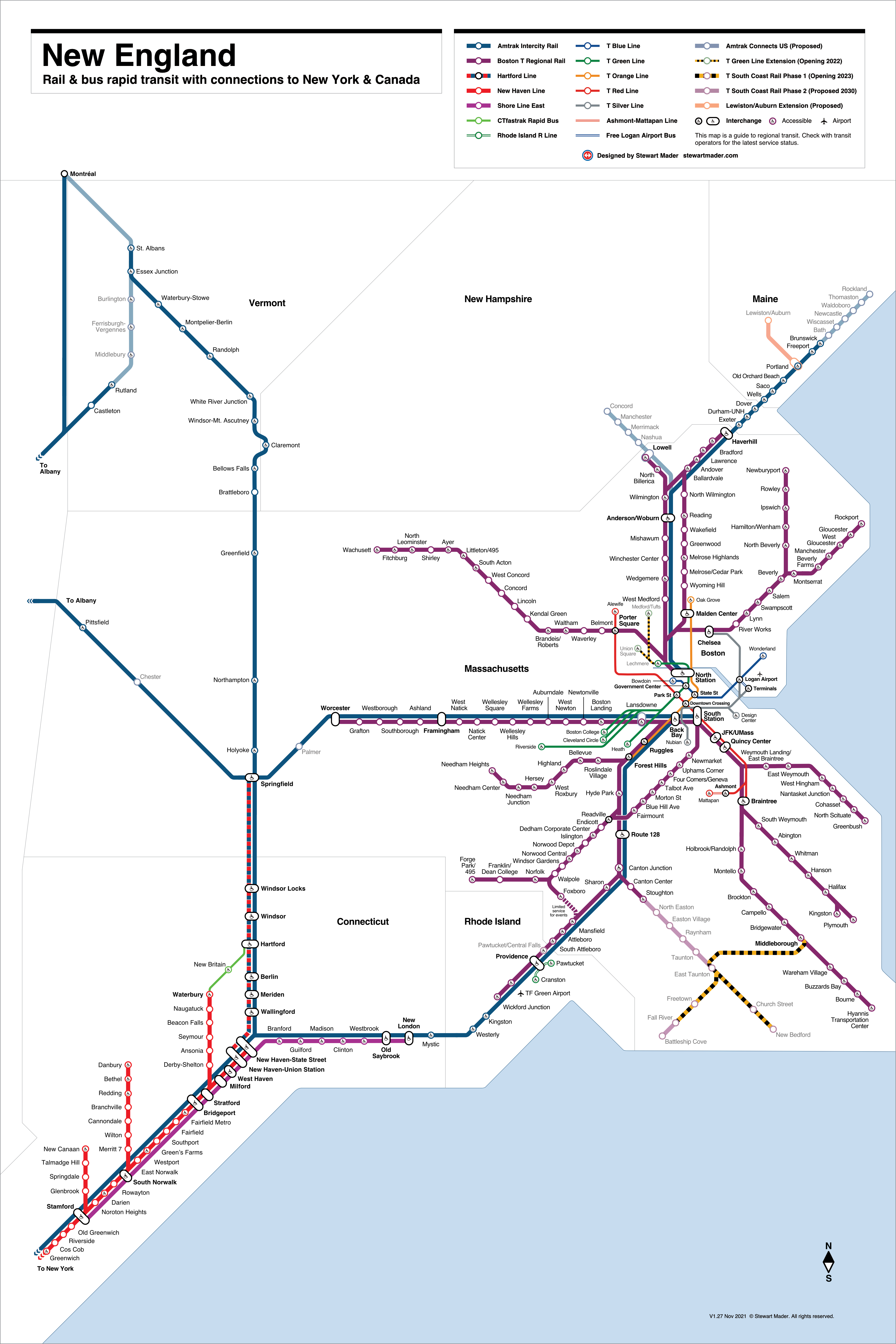
New England Transit Map
The New England Transit Map is a comprehensive diagram of rail and bus rapid transit throughout the six-state New England region. It is designed to help people choose transit by showing them an integrated view of transit options.
Current services are represented by brightly colored lines and station markers. Services coming soon are represented by opaque lines and station markers in the colors of the services they will augment. Potential new services under consideration are represented by opaque gray lines and station markers.
Current Services
- Amtrak – Intercity rail (dark blue lines).
- Boston T (MBTA) – Rapid transit and regional rail in eastern Massachusetts and Rhode Island (blue, green, indigo, orange, purple, red, and silver lines).
- CTfastrak – Bus rapid transit in central Connecticut (light green line).
- Hartford Line – Regional rail connecting New Haven-Hartford-Springfield (yellow line).
- New Haven Line (MTA Metro-North) – Regional rail along Connecticut coast (red line).
- Rhode Island R Line – Bus rapid transit (light blue line).
- Shore Line East – Regional rail along Connecticut coast (fuchsia line).
Enhancements
- Pawtucket/Central Falls Transit Center – Opened Jan 23, 2023
- Providence Station State of Good Repair Project – 2024
- South Attleboro Station Accessibility Improvements – TBD
- South Coast Rail – Late 2023
- Winchester Center Station Accessibility Improvements – Spring 2024
Ready for the Future
In addition to existing lines, the map includes transit lines and stations under consideration, to increase awareness of projects that will make it even more convenient to take transit. It also makes the map design more durable, because it won’t need to be redrawn to make space for these additions. For example, the map is designed to accommodate potential future service on the Grand Junction connecting Worcester with North Station, as well as the North South Rail Link, which would link Boston’s separate northside and southside rail networks into a single regional network, increasing capacity and enabling through-running of T Regional Rail trains, as well as Amtrak intercity trains.
- Allston Multimodal Project & West Station – MassDOT
- Amtrak Connects US – proposed extensions of Amtrak service
- Berkshire Line – New York City & Pittsfield, MA via Danbury, CT
- East-West Passenger Rail Study – MassDOT, Pioneer Valley Planning Commission
- Eastern CT Corridor Rail and Transit Feasibility Study – CT DOT
- Hartford Line – New stations in development at Enfield, Newington, North Haven, and West Hartford
- Maybrook Line – Danbury, CT & New York City
- Nashua-Manchester Passenger Rail Project – NH DOT
- Northern Tier Passenger Rail Study – MassDOT, Trains in the Valley
- Portland to Bangor Transit Propensity Study – MaineDOT, Maine Rail Group, Northern New England Passenger Rail Authority
- Rail Vision – MBTA
- Red Blue Connector – MBTA Rapid Transit extension of Blue Line to connect with Red Line at Charles/MGH station
- Silver Line Extension Alternatives Analysis – MBTA is studying the feasibility, benefits, and cost of extending Silver Line service to Everett and the surrounding communities.
- T.F. Green Airport Station Expansion – RI DOT
An Integrated & Inclusive View of Transit
The New England Transit Map’s design emphasizes, “simplicity, balance, coherence, harmony, and not too much topographical distortion,” a set of principles described by Maxwell Roberts. The map balances an emphasis on central areas where lines and systems converge with geographical accuracy in the placement of stations relative to each other, and includes state and water boundaries that reflect the “shape” of New England.
Maps have always been projections of power. When looking at maps, we should focus more on seeing them as narratives, particular versions of a story reflecting a specific interpretation and angle.
Mateusz Fafinski, historian of late antiquity and the Middle Ages, and lecturer at Freie Universität Berlin.


Access is Central
Access is central to this map, as reflected by placement of the International Symbol of Access (ISA) in the center of the circular visual marker for every accessible station. This design is also future-proof. As stations are upgraded to be fully accessible and ADA-compliant, the designation can be added without rearranging the spacing of stations and labels.
Color
Wherever possible, line and station colors come from each transit agency’s brand standards. Interchange stations use the neutral color black, and seamlessly convey meeting points in the network, regardless of agency boundaries.
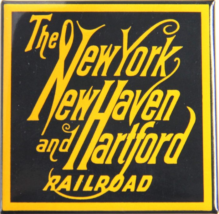
Rules sometimes require exceptions. Red is used by the Connecticut Department of Transportation (CTDOT) on its Hartford Line map, and the Metropolitan Transportation Authority also uses red on its New Haven Line map. This could create confusion because the two lines interchange in New Haven. The New England Transit Map solves this potential for confusion by depicting the Hartford Line in yellow. This clearly differentiates the Hartford Line from the New Haven Line, and the yellow color is a historical nod to the yellow used by the New York, New Haven and Hartford Railroad, the predecessor operator of both lines.
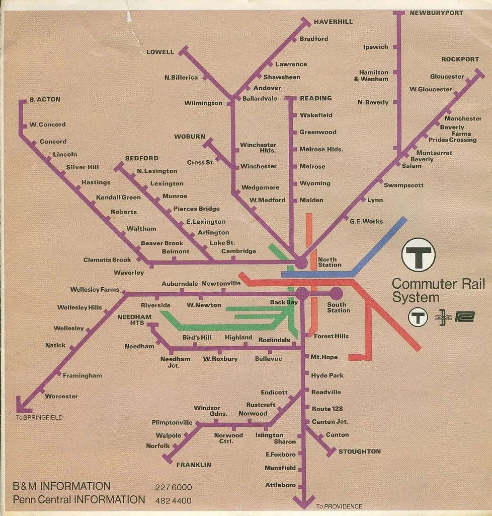
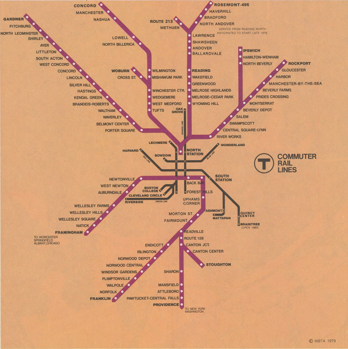
The integrated presentation of Boston’s rapid transit and regional rail on the New England Transit Map was influenced by the 1967 Diagrammatic “Spider Map” of T Rapid Transit Lines from CambridgeSeven Associates, and the 1976 and 1979 T Commuter Rail System maps, which used purple to create a cohesive view of regional rail lines transitioning from the Boston & Maine and Penn Central to the newly formed Massachusetts Bay Transportation Authority. The 1976 map included the T rapid transit lines, without station labels, to show how they relate to the regional rail lines. The 1979 map used only black for the T rapid transit lines, and added labels to the terminal stations.
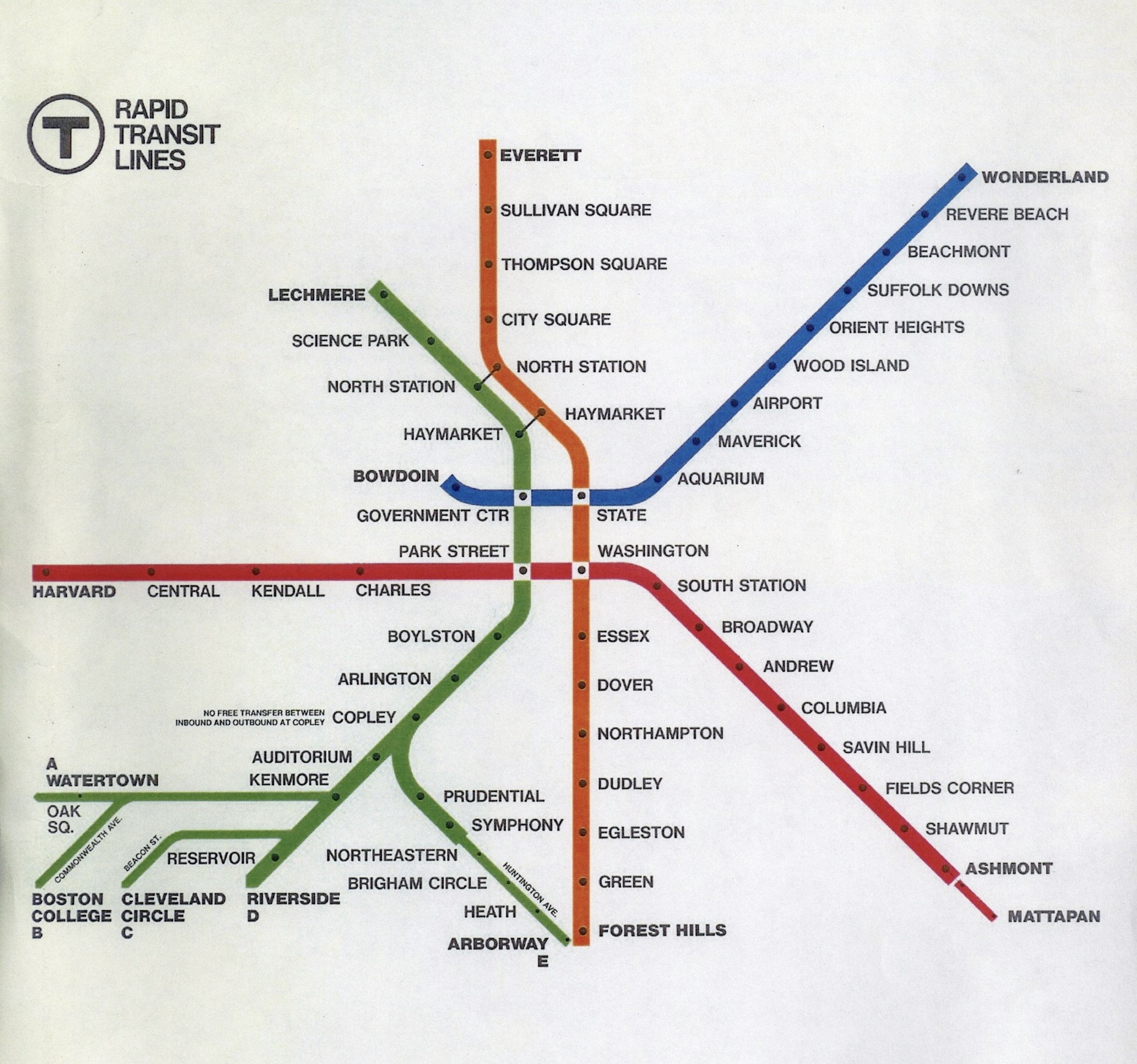
On the New England Transit Map, I incorporated the colors for the five T rapid transit lines, and emphasized their local focus with a thinner line weight than the regional and intercity rail, consistent with the thinner line weight for CTfastrak and the Rhode Island R Line. To strengthen the connection between rapid transit and regional rail, I included and labeled the four downtown core interchange stations and the connections to commuter/regional/intercity rail at North Station, South Station, and Back Bay in addition to the terminal stops on each T rapid transit line.
The Fairmount Line is colored indigo to reflect ongoing efforts by the City of Boston, Fairmount Indigo CDC Collaborative and Fairmount Indigo Network to increase service frequency along the corridor and transform it into Boston’s sixth rapid transit line.
Type in Transit
I used the Helvetica typeface to convey a standard, system-agnostic approach to labeling elements throughout the map. To make the map easy to read, I set all station labels in horizontal type. Along with expanded central areas, horizontal labels enhance the map’s usability, especially where the close physical proximity of transit lines would be difficult to represent in a geographic map. Bold labels are used for interchange stations, underscoring their role in helping people transfer at key points where lines connect.
My use of sans-serif type was influenced by Fred Stingemore’s 1931 London Underground map, and by Paul Shaw, who illustrated the mid-20th Century move to standardize transit information design and wayfinding tools his 2011 book Helvetica and the New York City Subway System. Shaw’s 2011 poster for a talk on his book cleverly illustrates the motivation to replace what he called a “competing jungle of signage” with a modern system. My use of horizontal type was influenced by Erik Spiekermann, who led the redesign of the passenger information system for Berlin’s transit.
Evolution of the Map


