Branding New Jersey’s Transit Lines
When I led customer experience for NJ Transit, I created a cohesive identity for all of its transit lines, including buses, light rail, and paratransit, to better convey the full reach of the third-largest transit system in the US.
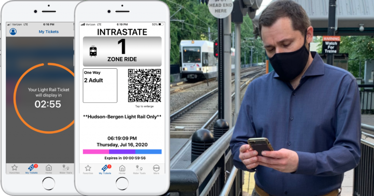
I saw an opportunity to update branding designed in 2003 to meet the needs of digital and social media-savvy customers, who increasingly engage with brands through apps and social media. The branding also needed to be expanded, from train lines only to all transit modes.
With these new needs in mind, I assembled a “can-do coalition” of colleagues to achieve three goals:
- Expand branding beyond train lines with new icons for bus, light rail, and paratransit.
- Optimize the brands for digital uses, including the website, app, and social media.
- Increase consistency in presentation of the brands by more closely tying together the colors and symbols.
Our new effort reinforced the three goals of the 2003 brand identity project:
- Strengthen recognition of the rail lines as a convenient means of mobility connecting New Jersey with New York and Philadelphia.
- Make the system more inclusive. Reducing reliance on language-based names is especially helpful to customers with limited English proficiency (LEP) or low literacy.
- Improve accessibility by using symbols for visual distinction. This helps customers with color vision deficiency (CVD) who may have difficulty distinguishing between certain colors.

Updated & Expanded Transit Brands
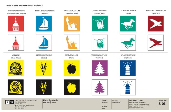
I worked with in-house graphic design and operations colleagues to select easily recognized icons for NJ Transit’s Access Link paratransit, bus, and light rail lines, including the iconic copper clock tower at Hudson-Bergen Light Rail‘s Hoboken Terminal, a pink cherry blossom from Newark’s Olmsted-designed Branch Brook Park for Newark Light Rail, and a light rail train in the green color of the River Line‘s original railroad, the Camden & Amboy.
To strengthen the association of symbols with lines, we colored the symbols in the corresponding line colors, and enclosed each symbol in a circle of the same color, evoking the symbol used on trains in the early 1980s by the New Jersey Department of Transportation after it inherited operations from the Penn Central.

The result of this redesign is a stronger visual presence for each icon, especially when seen at small sizes.
Access Link
Stylized version of the Access Link brand featuring the International Symbol of Access.
Atlantic City Line
Absecon Lighthouse, New Jersey’s tallest lighthouse, and the third-tallest masonry lighthouse in the United States, visible throughout the Atlantic City Line’s namesake city.
Bus
Bus approaching a stop to pick up passengers on NJ TRANSIT’s 252 bus routes connecting communities throughout New Jersey.
Hudson-Bergen Light Rail
Hoboken Terminal clock tower, atop the transit hub connecting Hudson-Bergen Light Rail with NJ TRANSIT buses & trains, the PATH subway, and ferry service.
Main-Bergen County Line
Meadowlands cattail and Passaic River watermill, two iconic symbols of nature and industry in the region served by the Main-Bergen County Line.
Montclair-Boonton Line
Eastern Goldfinch, the state bird of New Jersey, which nests in meadows and wetlands much like Great Piece Meadows and Troy Meadows along the Montclair-Boonton Line.
Morris & Essex Line
Colonial drum and galloping horse, highlighting the Revolutionary War history along the Morris & Essex Line, and the state animal of New Jersey, which can be seen with the United States Equestrian Team in Gladstone, and the famed Far Hills steeplechase.
Newark Light Rail
Pink cherry blossom from Newark’s Branch Brook Park, which contains the largest collection of cherry blossom trees in the United States, and is easily accessible from multiple Newark Light Rail stations.
North Jersey Coast Line
Sailboat highlighting the coastal heritage of the Jersey Shore communities served by the North Jersey Coast Line.
Northeast Corridor
New Jersey State House in Trenton, New Jersey’s state capital and southern terminus of NJ TRANSIT’s Northeast Corridor service.
Pascack Valley Line
Pine tree from the northern coastal forest that dominates the landscape of the region served by the Pascack Valley Line.
Raritan Valley Line
Statue of Liberty from the logo of the Raritan Valley Line’s predecessor, Central Railroad of New Jersey, whose mainline once led to the historic Communipaw Terminal with waterfront views of the Statue of Liberty.
River Line
River Line train in deep green, the color of the Camden & Amboy Railroad, New Jersey’s first railroad, and builder of the right-of-way now used by the River Line.
Rebranding a Redesign
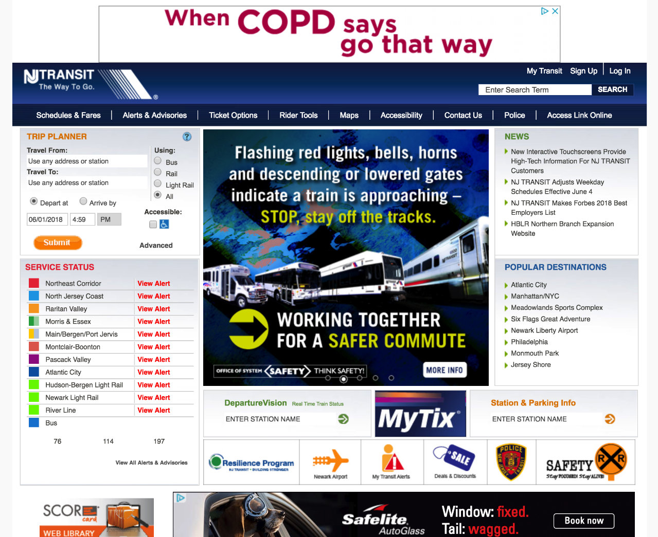
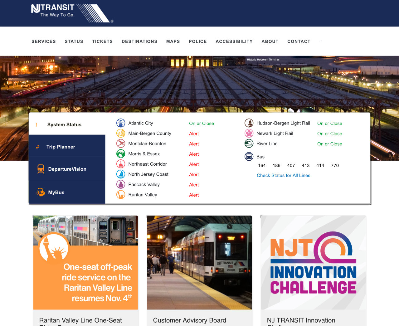
The refreshed and expanded transit brands launched in concert with a redesign of NJ Transit’s website, app, and social media platforms. The njtransit.com homepage and app use the individual line brands to share system status at a glance.
Twitter accounts for bus, light rail, paratransit, and train services feature the new transit brands, new cover images that illustrate each service, and updated descriptions to let customers know each account is the place for real-time information, updates, and alerts.


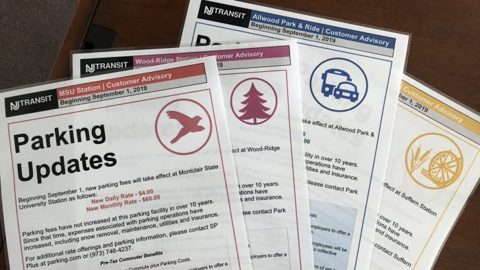
Redesigned service advisory posters make use of the new design system for easy recognizability in busy stations. Prominent placement of the new branding helps customers quickly discern whether an advisory applies to their line. A standard header includes line names and service advisory dates for additional clarity.
Rebranding New Jersey’s transit lines makes them more recognizable and memorable. Redesigning the NJ Transit website, app, social media, and customer advisory posters streamlines the presentation of transit throughout the customer journey. Together, these transit branding and technology improvements enhance the experience for customers, and make it easier to choose transit.

