Chicago Transit’s Digital Redesign Offers Blueprint for Transforming Customer Experience
Published in Mobility Lab – December 12, 2018
Transit users are an agency’s most valuable source of insight. Customers typically use an agency’s website to plan trips, check arrival times, and get updates on planned work. Visitors typically need to get maps, figure out fares, and find their way around. Journalists, advocates, and policymakers need to keep up with capital plans, system improvements, and service quality for their constituents. Engaging with each group gives an agency the ability to inform, drive, and optimize its services in ways that can continually energize their relationship with transit. Jennifer Pahlka, founder of Code for America, and former US Deputy Chief Technology Officer during the Obama Administration calls this delivery-driven government.
Knitting together technology, user data, service design, operations, and policy into tight feedback loops creates the conditions to constantly adapt programs and improve outcomes…By modernizing and instrumenting the systems that deliver these services, governments can continually adjust the technology, operations, and low-level policies of a program as needed in service of the desired outcomes.
The Chicago Transit Authority (CTA)’s redesign of transitchicago.com shows how agencies can upgrade the digital infrastructure of transit to make trains and buses easier to use. The new transitchicago.com demonstrates a thoughtful approach to customer experience for the 1.6 million daily riders who use the city’s “L” rail rapid transit system and buses. Tony Coppoletta, CTA’s manager of External Electronic Communications, part of the agency’s Customer Information group, noted that CTA took great care to make design decisions that enhance how the site works, and to avoid purely aesthetic changes.
We were careful to try and make sure that the design was never different merely for the sake of being different—so we chose to maintain lots of familiar attributes, ranging from the functional to certain organizational constructs to even certain look-and-feel choices so the revamped site would be familiar, intuitive, and unintimidating.
Coppoletta underscored the importance of giving customers a consistent, information-rich experience on all devices and screen sizes, and streamlining the customer experience at the transition from social media channels to the website.
One of our big goals (particularly with the pervasiveness of smartphones and that we now have blisteringly fast 4G LTE service throughout our entire network of subway tubes, tunnels and stations) was to bring the full site to people—not just basics, but all the rich content we produce—by completely refreshing to a “responsive” design for mobile. We also really like that we can confidently share all our web content in social media spaces without worry that a link to a page might not look great on whatever device someone is using when they tap the link.
On the new website, trip-planning tools and time-sensitive updates are prominently featured at the top of the homepage. This is especially useful for riders who use the website on phones while on-the-go. The trip planner gives customers the ability to set a starting point and destination by entering an address, selecting a station, or granting access to their location, which is especially useful for new customers or those visiting an unfamiliar portion of the transit system. Options to “Leave now”, “Depart at”, “Arrive by”, and “I need an accessible or step-free trip.” are presented in a friendly tone, framed from the customer perspective, that makes it easy to build these requirements into transit plans right from the start.
Two tools–Quick Links and System Status Snapshot–appear throughout the site, for easy access to essential information, including schedules, fares, maps, real-time bus and train trackers, and the Ventra transit card. System Status Snapshot equalizes the experience for all customers by providing a single source for train, bus, and elevator status. Descriptive updates like “Planned Work w/Stations Bypassed” for the L, and “Temporary Reroute” for bus lines help customers make sense of service disruptions, and minimize the potential for confusion. Feature cards highlight newsworthy information, including airport service, bikes on transit, how-to-guides for new transit users, and system improvement projects.
The website footer provides a directory of agency information, including links for job seekers, media, vendors, advertisers, and employees. CTA also includes links in the footer to its peer agencies: Metra regional rail, Pace suburban bus, and the Regional Transportation Authority (RTA), which is responsible for transit oversight and planning throughout the region. This is a smart, simple way to bridge agency boundaries and streamline the transit customer experience.

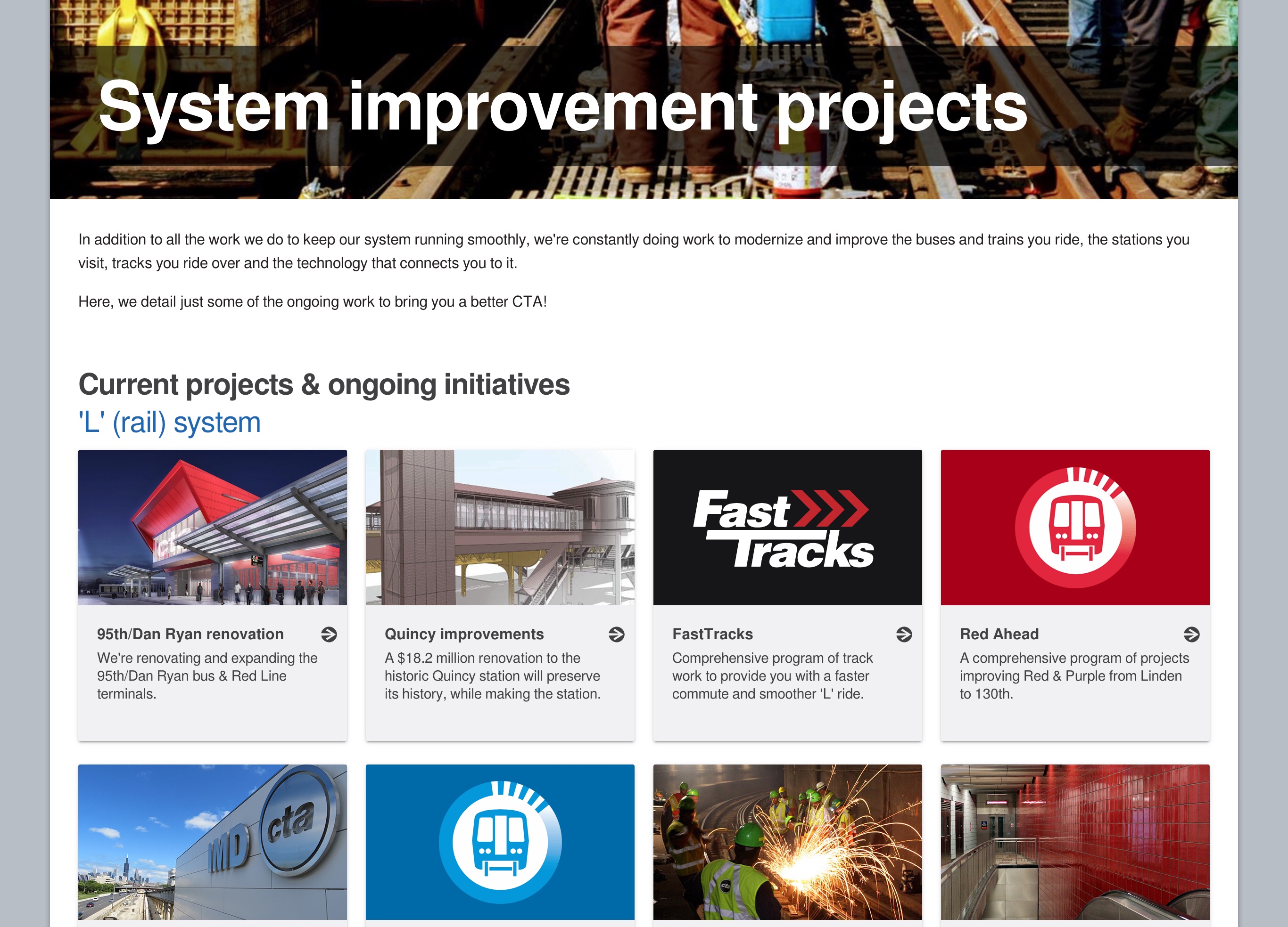
System Improvement Projects is a directory of construction taking place throughout the CTA system. The new transitchicago.com conveys the benefits of investment in transit by helping customers track the progress of station renovations, track replacement, signal upgrades, and other improvements to the physical infrastructure of transit, with project pages that highlight the benefits of each project, along with timelines, renderings, and photo and video updates.

In addition to the project pages for physical improvements, CTA smartly frames the website redesign as a work-in-progress with a welcome page that highlights What’s New?, What’s Not?, and What’s Next?. The welcome page puts the current redesign in context by including the visual history of transitchicago.com, with screenshots that show the evolution of the site from its launch in 1996 to the present day.
CTA wraps the welcome page by enthusiastically asking for feedback. Coppoletta shared how CTA used the feedback process to honor people’s contributions, and create an environment for ongoing, constructive engagement.
Like a good transit trip, a good visit to a website is one you probably don’t really remember: you went there, it did what you needed it to do and you’re on to other things—but you definitely notice when something didn’t work quite as expected, so we also know people are more likely to reach out about something they didn’t like than something that just worked as expected.
We wrote back each user who wrote in to thank them for their feedback and explain what improvements we made based on it, and also solicited further ideas and suggestions. We wanted users to know that, as is rarely perceived to be the case with big websites and orgs, they are an important part of how we make decisions and we acted directly on what they had to say—something I try to do as best as possible in public-facing design projects (from digital signage to web services) and encourage anyone in a similar role to do as well.
Coppoletta explained how CTA is studying the redesigned website’s impact on customer experience to gauge its success. He compared usage statistics for November 2018 with the same month in 2017, prior to the redesign, to see how CTA’s investment in the website’s redesign has changed how people use transitchicago.com.
The total number of users is similar but the number of pageviews and time people spend in a session with the site have gone down—something we view as a positive effect because the bulk of our traffic is people trying to find travel info in a jiffy, as you’d imagine.
Coppoletta said mobile traffic to the redesigned site has increased, especially to new pages that offer more detailed information during service disruptions. This is likely an indication of the combined benefits of the new, mobile-friendly site and widespread availability of data service throughout the CTA system.
Naturally, we’re seeing more mobile traffic to pages that didn’t used to get as much, and (at least anecdotally) have watched spikes occur during disruptions to service info and detailed alert pages which implies this is something that’s long been in high demand, just never as easy to get to on phones. We believe people are now benefitting greatly from the full compliment of content on our website now being equally available on mobile viewports.
Building a new website isn’t just about the website. Creating a compelling digital threshold makes transit easier to use. Engaging the community enables customers to benefit from the insight, experience, and expertise of their fellow transit riders. Creating a cycle of enhancement that extends from the digital tools to the daily ride builds trust in transit, and strengthens the environment, economy, and quality of life in cities.


