Pick, Johnston & Kono: History of the London Underground Typeface
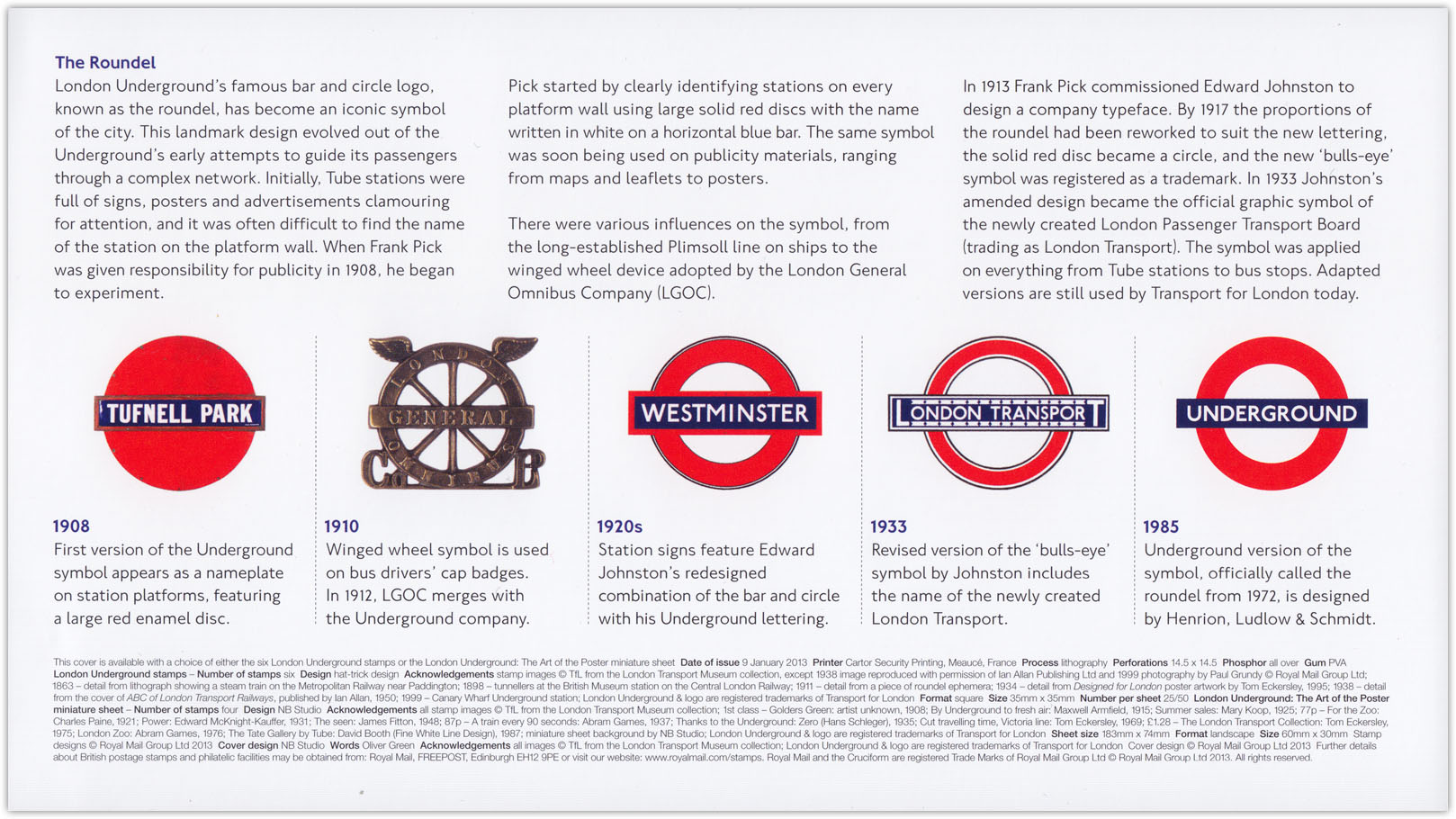
The story of the London Underground typeface is important to urban history because it set the standard for identity and communication in railway systems around the world. It starts with Frank Pick, publicity manager for the London Underground.
Pick himself was not a designer, but he understood the importance of good design:
Corporate Design, Pick believed, should be consistent, it should be easy to grasp and (almost above all else) it should look good.
This belief grew, in part, from work Pick carried out on promotional poster campaigns for the Underground in 1908. Noting the success of a similar campaign carried out by the North Eastern Railway, Pick commissioned a series of posters depicting the various interesting landmarks and locations Londoners could get to by tube. Pick tried to ensure that all the posters produced were of a very high visual quality, and the campaign was a success. It was even more successful, he noticed, when he took things further and made sure that the posters were well illuminated and positioned with an eye to where they would actually be noticed – a principle that over the next few years he extended to maps and signage.
Pick also knew he needed someone who could create something brand new to meet his exacting specifications. Enter Edward Johnston, a rising star in the typography world who was introduced to Pick by Gerald Maynell of the Westminster Press:
The typeface should have “the bold simplicity of the authentic lettering of the finest periods” Pick wrote to Johnston. It should also, he told him, be easy to read from a moving train and in bad lighting, be noticeably up-to-date with the times, and yet also be completely different from anything found on other shops and signage. Finally, in true Frank Pick style, Johnston was told that each letter should be “a strong and unmistakeable symbol.”
It doesn’t spoil the ending for me to say that Johnston delivered. The rest of the story, with bits and pieces about what influenced Johnston as he developed the typeface, is well-worth reading.
The third major player in this story is Eiichi Kono, the designer who was hired to rework and update the typeface in the 1970s. He has written a detailed first-person account (PDF) of his work, complete with lots of sketches and test-renderings.
Via kottke.org


